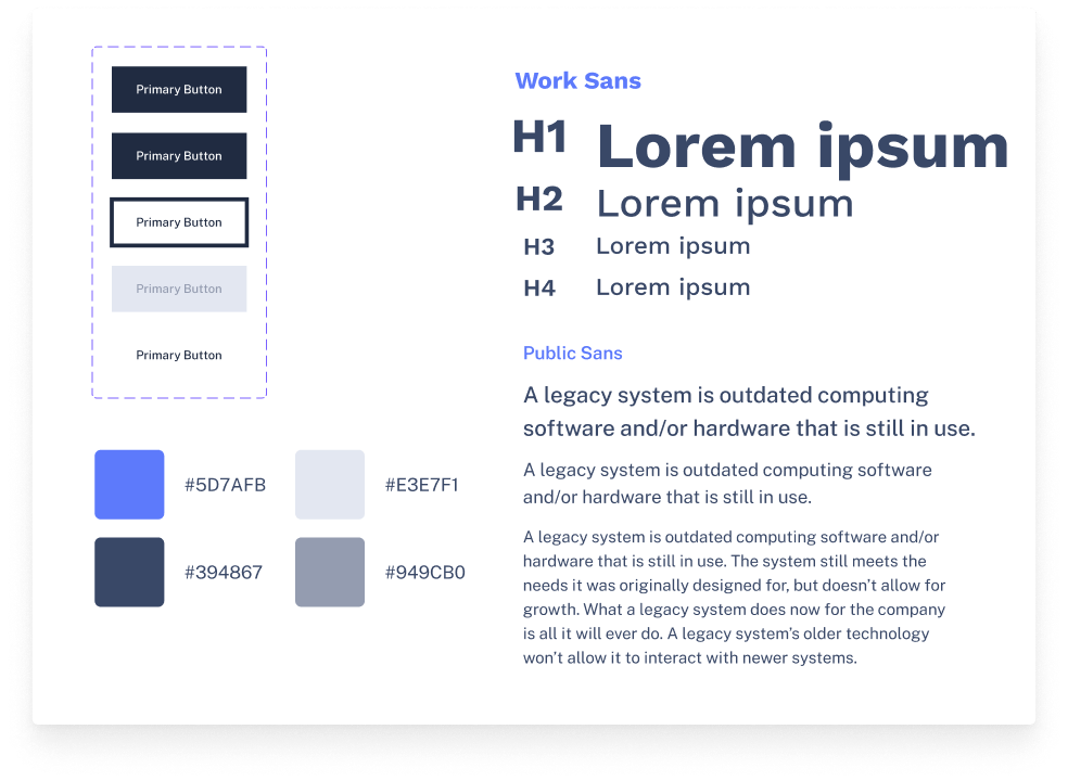
The chosen typography refers to the seriousness of the company – sans serif and with fonts that refer to technology. The font Work Sans was used for titles, and Public Sans for texts in general. The colors were chosen due to the company’s field of activity where blue is predominant as a color that alludes to technology, safety, and reliability.